OneFootball
Alex Mott·3 August 2019
🤮 to 😍: Ranking every 2019/20 Premier League home kit

In partnership with
Yahoo sportsOneFootball
Alex Mott·3 August 2019

The new Premier League season is nearly upon us.
But which kits have caught or eye and who’s going to be committing the ultimate fashion crime this year?
A kit so woeful that even Huddersfield’s ‘banterous’ sash shirt from earlier in the summer is an upgrade on this monstrosity.
Busy stripes with weird block of colour at the top? Check. Horrendous, oversized betting sponsor? Of course. Just horrible from Southampton.
It’s difficult to get blue and red stripes wrong, and yet somehow Palace have managed just that. What on earth is that little white pinstripe? And look at the state of that collar.
Like one of Eddie How’s press conferences – just boring and forgettable.

We like what Umbro have done here, but it’s been completely ruined by that parody of a sponsor.
A kit inspired by the last time Newcastle won a trophy. It’s almost like Mike Ashley is trying to shamelessly appeal to the souls of Newcastle fans. It doesn’t wash with us.
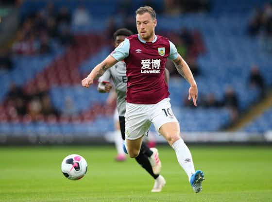
The kit itself is absolutely fine. A solid, mid-table effort. But that sponsor? That’s another Premier League shirt ruined.
Introducing the new @adidasfootball Wolves home kit for 2019/20! Pre-order 👉 https://t.co/7jGZTNw9vo–
A solid effort from Wolves but still a bit of a downgrade from last season. See Burnley, Sheffield United and Southampton for our thoughts on the sponsor.

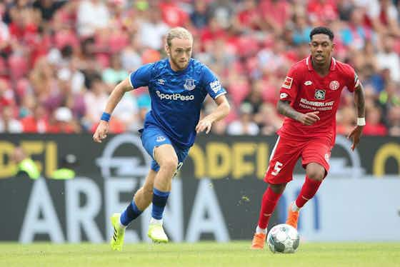
Umbro have done a pretty decent job with their kits this season and this is no exception.
Apart from the marketing guff which states that the pattern on the top half of the shirt is “inspired by Goodison Park”. Oh do sod off.
Almost exactly the same as last season’s strip apart from the addition of a gold Nike logo. Not for us, Clive.
Purple seems like an odd trim for this kit, doesn’t it? Not a patch on their new away shirt either.
The only table Manchester United will be beating City in. This kit is another inspired by the past, this time the 1999 Treble.
Which is bizarre because surely that anniversary was last season?

A huge upgrade on last season. We’re loving the half-and-half design, but once again a decent shirt has some marks knocked off for that eyesore of a sponsor.
Kappa = good. It’s that simple really.
Love, love, love. Simple, effective and topped off by that glorious checkerboard design.
Just lovely. Inspired by the FA Cup win of 1980, this home shirt is a delight from start to finish.
Only the introduction of light blue shorts would have made this better.

A bit mad, but this is a helluva lot more interesting than some of the kits this season – and for that we’re putting it in the European places.
As we’ve seen with Palace – pinstripes can go wrong. But this new Liverpool shirt is an example of how to do them absolutely right.
Nike have gone for the less-is-more approach to this (insert trophy cabinet joke here) – but my lord does it work. Lovely stuff.

The obvious choice, but it’s so obvious that anything else would just feel wrong.
This is an instant classic.


