OneFootball
Lewis Ambrose·14 November 2019
📸 The top 20 kits of the decade 😍👕

In partnership with
Yahoo sportsOneFootball
Lewis Ambrose·14 November 2019

The 2010s are reaching their end and that can only mean one thing … it’s time to decide on the very best kits of the decade.
And yes, we know there aren’t many home kits here. It’s just easier to be more creative with away strips, we guess!
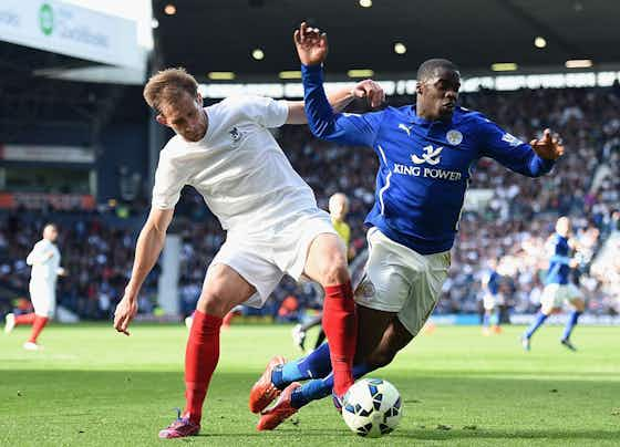
Worn just once, in memory of the legendary Jeff Astle, this was an absolute beauty. You don’t get clean-cut simplicity like it nowadays and football’s a worse game without it.

A superb pattern that could be mistaken for Nike advertising Umbro. The shades of red are absolutely perfect.
It doesn’t look all that from afar, but zoom in and the patterned triangles in various shades of green, plus the gold badge, make this a stunner.

An instant classic, a brilliant take on the iconic pattern across Germany shirts, adidas have actually bettered the original (and it still isn’t the best version … See below for further details).

The colours are great here; gold details almost always look superb and the deep blue is delicious. The metaphorical cherry on top, though, is the superb imprint that covers the entire jersey.

Black and gold, a classic combination. This shirt, adorned with the signature of Ayrton Senna, was an homage to the racing legend. We fully approve.

Sometimes you can’t beat an iconic combination. Sometimes you perfect one. This, with its yellow trim and perfectly sized stripes, is the ultimate Barcelona shirt and was worn by the ultimate Barcelona team. Simple, classic, perfection.

We all remember Germany’s demolition of Brazil but it’s easy to forget how good they looked doing it. Dennis the Menace would be proud.

A few facts for you.
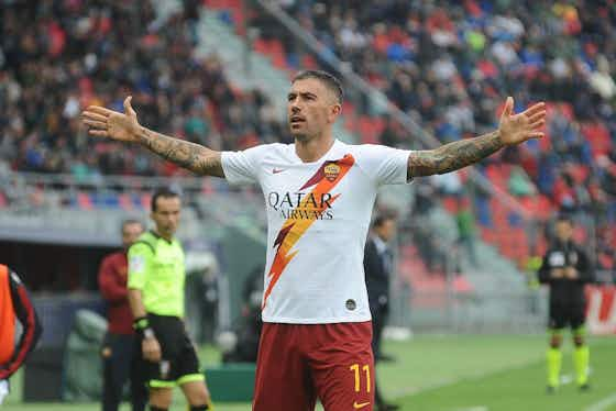
There was a real buzz when Roma released the current season’s away kit but we think the lightning bolt got people a bit too overexcited. Glorious, yes, but this is a great year for kits and this one doesn’t quite crack the top 10 of the decade.
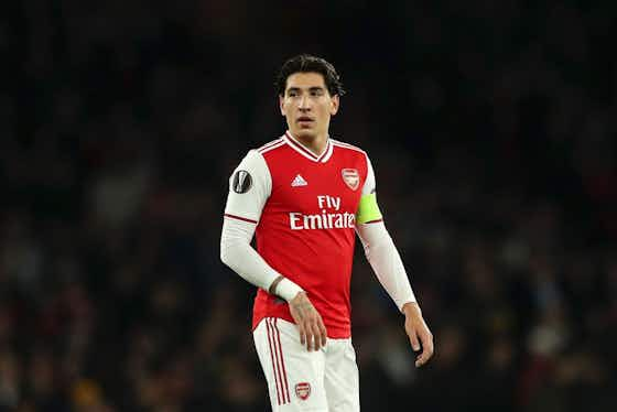
Again, sometimes a classic just works. Adidas are back making Arsenal kits and this season’s, with its perfect shade of red and simple details, is arguably the greatest home kit in Premier League history. At least their fans have something to be proud of.
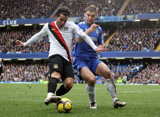
Sponsors not in the middle of shirts. MORE OF THIS, PLEASE! That also goes for sashes.
And yes, we think the fact this was worn in 2010 means it does (just!) qualify.
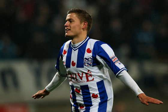
Heerenveen make superb and unique home shirts but this effort was the best they have ever churned out. We want one.
A one-off shirt is released for the carnival period in Köln every year. The one brought out 12 months ago was instantly iconic.
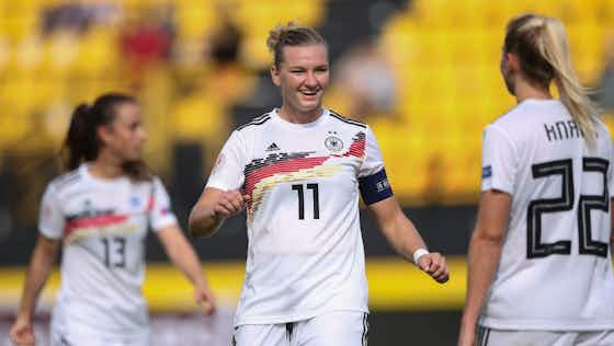
So we mentioned that Germany design earlier, on the Leicester shirt. But the top worn by the women’s team at the 2019 World Cup was the greatest ever rendition of one of the most memorable designs ever seen on a football kit.
Karl Lagerfeld had a hand in this and it’s not hard to see that it worked. Absolutely gorgeous.
Now tell me you’ve seen that design somewhere else before. A unique and stunning design, this smashes it out of the park. The away kit, by the way, was the same with the colours reversed.

Of course this would be on the list. No kit has been released to such fanfare this decade and with good reason.

What. A. Colour! And how often does the sponsor so seamlessly fit on a shirt?
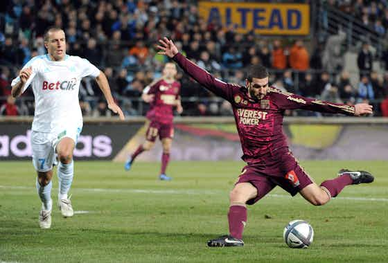
This is just perfect. Even with the sponsors. The deep colours, the brave pattern, the contrast with the gold details. This is the best kit of the decade.


