OneFootball
Alex Mott·6 August 2018
📸 Ranking all of 2018/19's Premier League home kits

In partnership with
Yahoo sportsOneFootball
Alex Mott·6 August 2018

We’re only a few days away from the start of the new Premier League season.
Which means we’re only a few days away from getting our first glimpses of the brand new kits for 2018/19.
But who’s looking catwalk-ready? And which clubs are committing the ultimate fashion faux pas?
Let’s find out.
Cemented firmly at the bottom of this season’s kit table. Watford’s latest bumble bee-inspired shirt certainly catches the eye*
*is eye-gaugingly terrible.
Under Armour’s designers must have had a day off when they submitted this as Southampton’s new home shirt. It looks almost exactly the same as last season’s and is the dictionary definition of meh.
Another shirt that has come straight out of the 2017/18 look-book. If you’re a Bournemouth fan and paying cold hard cash for this, then they’ve seen you coming.
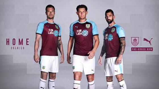
Apparently this was inspired by the Lancashire-Yorkshire railway, built in the second half of the 19th century. A similar time-period to where José Mourinho’s football has come from.
First half: yes. Second half: absolutely no. Kind of like all of Tottenham’s seasons over the past decade.
Just all sorts of no. The sleeves, the half-finished collar, the button. Probably the only thing that’s wrong with Manchester City going into this new season.
Like a five-year-old has been given access to all their crayons and designed a football kit. Bright blue. Deep red. Canary yellow. No wonder Wilf Zaha wants to leave this summer.
😍 A debut for the new Nike home kit - like what you see? #BHAFC 🔵⚪️ Buy ➡️ https://t.co/k1291ItkPY–
You can’t go too wrong with light blue and white stripes, but this is another Nike kit festooned with that awful half-collar thing.
It’s always good to see Cardiff back in blue, but this is one of the more forgettable kits this season.
Another middle of the road home shirt to add to this season’s list. Oh how we long for the Newcastle Brown Ale days.
🔵⚪️ Saturday 7 July 🔵⚪️ 👕 #htafc Home shirt in store 🏴 Quarter Finals! https://t.co/WbHNDTRlK3–
In mid-table on our list for a reason. You’ve forgotten what this shirt looks like even as you’re looking at it – but it’s made better by those Umbro diamonds on the sleeve.

Just a low-rent West Ham. Sorry Burnley fans.
Introducing the new @adidasfootball 2018/19 #lcfc home kit 🔵 ➡️ https://t.co/fXI5olV5KH #NewHorizons–
Any shirt Harry Maguire’s seen in is alright with me. Like the England hero, this is no frills and very much does the job.
Now we’re cooking. If seventh is a European place, then this wouldn’t look out of place on a Thursday night in the depths of eastern Europe. Big like from us.
We’re ignoring the Chelsea fan who claimed that Chelsea shouldn’t be having red in their home shirt. This new look Blues side with Maurizio Sarri at the helm deserves a new look home shirt.
Knocking on the door of the Champions League places. Ignore the Angry Birds sponsorship on the sleeve and focus entirely on that 90s-inspired Umbro diamond.
We’re all about the slightly pink cuff on the sleeve, the square cut-off along the shoulders and lovely Hector Bellerin and his lovely hair.
Back in the Premier League and back amongst the big boys when it comes to shirt designs this season. Their gold kit isn’t quite enough for our gold medal position though.
When you’ve spent north of €170m on transfers over the summer, you need a kit that reflects your club’s new title-chasing status. Liverpool absolutely have that this year.
“It’s just great,” says one of my fashion conscious friends … and we’re inclined to agree. Classy Fulham have gone all Scandi with their latest kit. We can’t wait to get ourselves down to the Cottage and see this one in the flesh.


Live


Live


