GiveMeSport
·20 June 2022
Man Utd, Liverpool, Arsenal: Every Premier League badge ranked from worst to best
In partnership with
Yahoo sportsGiveMeSport
·20 June 2022

Premier League club badges are amongst the most recognisable logos in the world.
While they might not be as identifiable as, say, the Apple and McDonald’s emblems, there are still millions of non-football fans who would instantly be familiar with the badges of Manchester United and Liverpool.
It’s part and parcel of these tiny logos being the centrepiece of branding for multi-million-pound clubs that appear on televisions screens week in, week out across pretty much every country in the world.
However, as with anything in the beautiful game, some just happen to be better than others and not all Premier League badges were made equally.
And given that we love hopping on the internet trend of ranking everything here at GIVEMESPORT, we couldn’t resist coming back to our annual ranking of all 20 Premier League badges.
As is the case with opinions on football kits, rating club badges is a subjective affair in which there are no right and wrong answers with the preference ultimately coming down to whatever floats your boat.
You only have to look at the doomed redesign of the Leeds United badge in 2018 to see that what some might consider to just be an inconsequential piece of graphic design is actually incredibly important to a club.
And no doubt the badge of the team you support has a particularly poignant meaning to you and the symbolism within the design might touch you in a way completely beyond our understanding.
As such, it’s important to clarify that as we call upon our trusty medium of Tiermaker to express our own opinion on the 20 badges that it’s not any slight on what a particular emblem might mean to you.
Besides, it goes without saying that our ranking is based purely on the aesthetic appeal of the badge’s design and not any sort of commentary on the greater meaning behind certain details and flourishes.
If it came down to that, then all 20 of them would most certainly land in the top tier because they are all, in their own way, beacons for the tribalism and togetherness of the sport we all love.
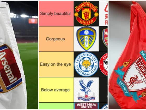
But for once, we’re advocating being so shallow as to make it all about looks and focusing on the beauty on the outside, so be sure to check out how we ranked every Premier League badge from ‘bottom of the barrel’ to ‘simply beautiful’ down below:
West Ham United, Manchester City and Fulham
We’ve ditched our ‘Downright ugly’ category this year because the messy emblems of Burnley and Norwich City have dropped down to the Championship, so our bottom tier isn’t quite so damning in 2022/23.
However, we’ll never stop banging the drum that City and West Ham’s modern revisions of their far superior old club badges have just ended up looking like oversimple creations mocked up on Microsoft Paint.
And when was the last time that you really had a close look at Fulham’s badge? Well, what happens is that you discover just how remarkably unremarkable it is with the ‘FFC’ initials crammed into a basic shield.
Crystal Palace, Tottenham Hotspur, Everton and Bournemouth
Maybe irregularly-shaped club badges where birds take centre stage just aren’t our thing because the sticky-outiness of Palace’s eagle and Tottenham’s cockerel have never tickled our fancy.
As for Everton, we perhaps controversially prefer the much livelier and yellow-shaded design from the early 2000s with the current iteration always looking drowned out in its dark blue and white bicolour.
And while we’re well aware that it’s Dickie Dowsett immortalised on the Bournemouth badge, we can’t help looking at it and thinking that they’re depicting a player heading the ball mid-shampoo at the hairdressers.
Leicester City, Brentford, Brighton & Hove Albion, Aston Villa, Chelsea and Southampton
The moral of the story here is that all six badges look clean, smart and tidy without doing anything particularly note-worthy or unique to get us heralding them as the very best in the Premier League.
The Leicester, Brighton and Brentford badges are the epitome of that point with their circular championing of a fox, bee and seagull leaving us with no complaints nor anything tingling down our spines.
It’s a similar story with Villa who, despite getting brownie points for the seemingly mid-attack lion, ultimately stay within their comfort zone for a badge that’s distinctly middle of the road.
Meanwhile, we’d probably give Chelsea extra points if they removed the random splashes of red on the four footballs and Southampton’s tree does that have the unfortunate look of being drawn by a child.
Leeds United, Arsenal, Liverpool and Newcastle United
It’s a slight downgrade for Leeds this year with the design starting to look a little outdated, but the marriage of blue and yellow within a uniquely-striped shield complete with the Yorkshire rose is still pure eye candy.
Meanwhile, Arsenal showed the world how you can make a modern badge without succumbing to clipart-like cheapness with the iconic canon and 3D effect on the shield shining in a cocktail of red, blue and gold.
Then we have the unmistakable class and reverence that drips from the badges of both Liverpool and Newcastle who were knocking on the door of the top tier with their successful balancing act amidst so many details.
Manchester United, Nottingham Forest and Wolverhampton Wanderers
What’s not to love? United’s badge strikes the aesthetic balance to perfection with the unique shape at which the eye-catching and iconic devil sits so proudly popping off the screen in red and yellow.
And let’s take a moment to appreciate the ‘less is more’ beauty of Forest’s emblem because the sharp red of the singular tree and river Trent above their name perfectly encapsulates the spirit of the club.
Then, simply enough, we’re bowing down to the throne of just how badass the Wolves badge looks because that evil all-back, straight-edged wolf just looks like it means business on a striking orange background.
Our sincere apologies to the thousands of football fans that we’ve inevitably annoyed.
Look, if you like the clipart style that City and West Ham have got going on, then power to you because life would be so much easier if we agreed and thought that all 20 badges were belters.
And while we tip our hat to the reality that each and every emblem is special to supporters in its own unique way, we’re happy to die on the hill that some look considerably better than others from a purely shallow perspective.
Does that mean we’re unhealthily obsessed with the badassery of a wolf silhouette and inordinately annoyed by the body shape of cockerels? Yes, yes it does, but don’t pretend as though you weren’t entertained.


