The Football Faithful
·31 July 2021
Five of the Premier League’s worst kits in 2021/22
The Football Faithful
·31 July 2021
Another new season is nearly upon us, with the summer months having seen a host of new kits enter the market as fans get a first glimpse of their teams new colours.
Football kits are big business and supporters are always hopeful over the latest number, with the latest Premier League releases containing the usual share of hits and misses,
We’ve picked out some of our least favourite designs, here are five of the worst new kits ahead of the 2021/22 Premier League season.
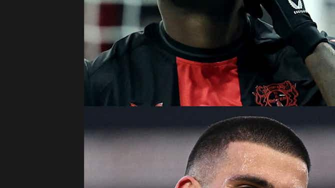
Fortune favours the brave or so the saying goes, unless that person appears to be on the design team at Nike and planning a daring new number for Tottenham’s away kit in 2021/22.
After a period in which Nike numbers were regularly slandered, the American giants have turned their fortunes around with a series of successes in recent seasons, bringing back retro vibes with Liverpool’s 2021/22 away shirt and creating a cult classic at Inter Milan last season.
However, It appears Nike have gone a little too bold for Spurs’ away-days this season, a jersey which resembles some sort of outer space galaxy as opposed to a Premier League shirt.
There will no doubt be fans happy to peacock in this unique design and you could see the shirt paraded around the fields of Glastonbury or another music festival, but it’s certainly not for us.
Chelsea’s new home shirt is another that requires an adjustment of the eyes on first viewing, with Nike having opted for a Kaleidoscope design upon the club’s traditional blue colours.
After a clean-cut – albeit safe – design last season, the zigzag mesh and unnecessarily large central sponsor make this one of our least favourable releases of the summer.
Privacy Settings
Blackburn, Crystal Palace have opted for a blue and white shirt for the new season, the Eagles third kit looking incredibly similar to Blackburn’s effort from three seasons ago – as adorned by Adam Armstrong in the below image.
Whilst there’s nothing exceptionally wrong with the below design from Puma, the colours will no doubt cause confusion amongst some supporters when Palace take to the field next season.
It just doesn’t look like a Crystal Palace kit, so it’s perhaps best it’s their third option.
Manchester City’s kit releases have continually underwhelmed in recent seasons and the latest home shirt has done nothing to buck that trend, Puma having failed to hit the mark once again.
The German sportswear brand have leaned towards arguably the club’s greatest moment for inspiration, with an all-over repeated graphic of a digital clock showcasing 93:20 – the time when Sergio Aguero scored his dramatic title-clinching goal on the final day of the 2011/12 season.
Sentiment aside, the design is poor and a rather deep-plunging V-neck makes you wonder just who is designing these shirts.
Leicester have opted for a mint choice for their away shirt this season, which will be paired with navy shorts and mint socks for the 2021/22 campaign.
Another V-neck (Yes, we’re not fans) and the ugly-looking sponsor make this one of the worst new releases, whilst the checkerboard design distracts from what could potentially have been a smart shirt with minor tweaks
Have you ever seen a player look less enthusiastic about a kit reveal than Jamie Vardy does below?
Proof that a picture can often speak a thousand words.